Orbeliani is a groundbreaking online platform for aid distribution, where civically engaged individuals share ideas for positive action in their communities.
How it works: Sponsors of development aid announce the funds available for new ideas, and citizens submit proposals for initiatives to use the funds. Proposals are easy to submit online, and include a list of supplies needed and the vendors who would supply those materials. When ideas are approved, the funds are transferred directly to the vendors, and every activity—including purchases—is published in a transparent feed.
The platform minimizes bureaucracy and allows citizens direct access to the resources they need to create change in their communities. It also allows for community members to explore the longevity of each other's initiatives and support each other in long-term activism.
PROPOSAL & DISCOVERY SESSION
Orbeliani's founder Mark Mullen approached me to submit a proposal for the UI/UX needs of their web app, which already existed in MVP form. My proposal was approved by the Orbeliani team, including staff in the Republic of Georgia, after which I flew out to San Francisco and sat down with Mark for some intensive discussions about the core purpose of the NGO, the best path forward for design and development, and a lot of identity design conversations.
LOGO DESIGN
Orbeliani's previous logo was two dolphins each curved to suggest a circular formation. I pushed for a redesign that could be more simple, clear, and iconic. Mark was very agreeable and we brainstormed a few concepts together including 1) reworking the idea of a circle, for a holistic system that lives on, versus some existing aid practices which involve short-term, in & out "projects." 2) suggesting maritime imagery, such as a cleat, rope or ship's wheel, because the long-term aims of Orbeliani are to operate worldwide, beyond the borders of any individual government, as maritime law does, 3) playing with the letter "O" to turn Orbeliani into a clear, iconic brand that doesn't always require use of the full name "Orbeliani."
LANDING PAGE
The web app changes would take some time to build, so we decided to start out making a landing page so that donors and interested parties could learn about the platform ASAP. I assembled this easily on Squarespace, you can see it here. The majority of my effort for the landing page was spent on crafting very precise, clear, simple wording to communicate the purpose of the organization, the donors behind it, the initiatives and a general understanding of the multi-feature web app.
UI/UX DESIGN: WEB APP
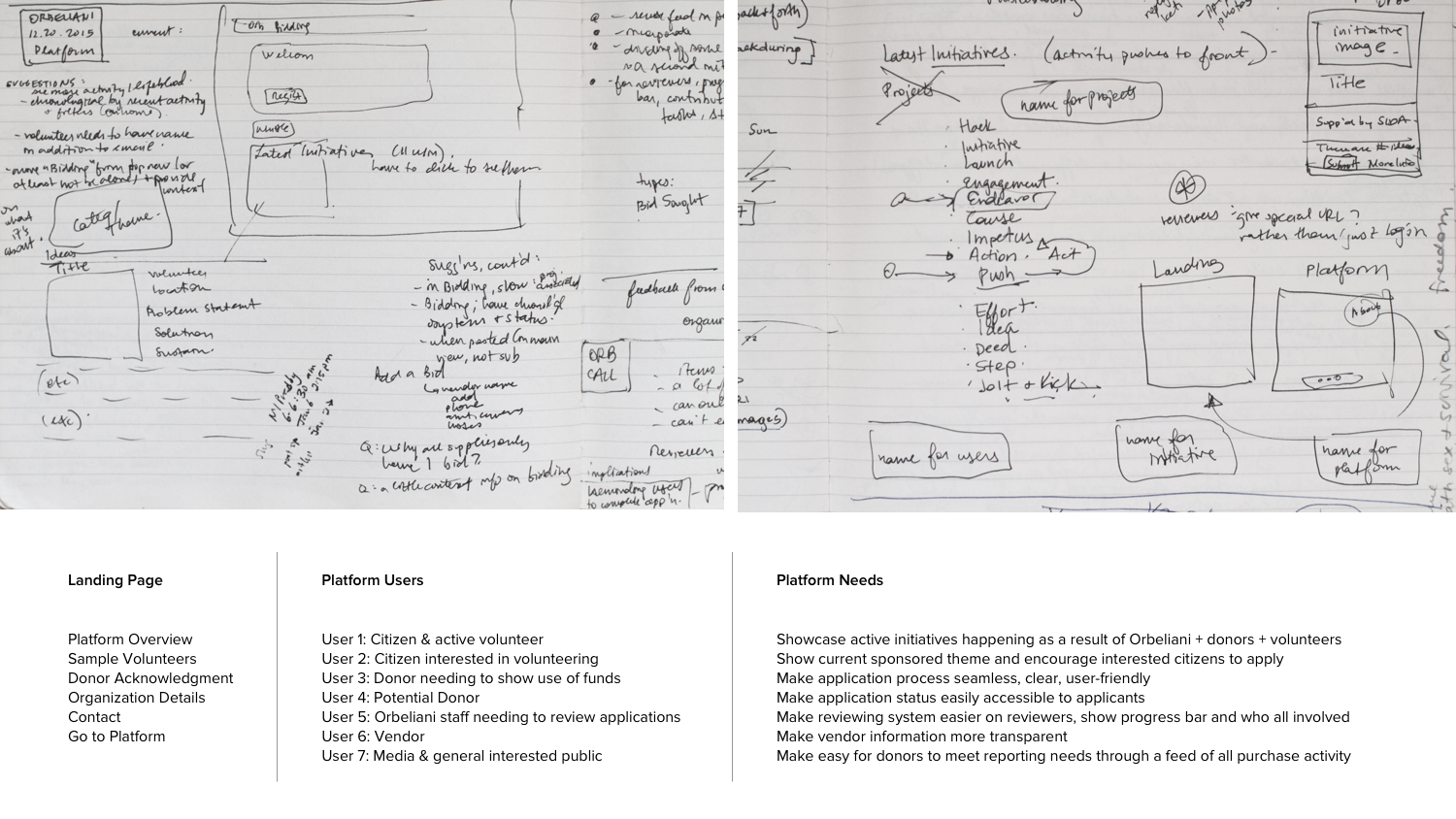
With the logo design, messaging, and landing page in place, I sat down to tackle the UI/UX for the multi-view, multi-feature web app. The MVP version was already built, with no design. I worked with Mark and George Song, our wonderful developer, to set new priorities for the structure of the app. I then created a few iterations of a set of designs for all the views, and prioritized easier browsing, more dynamic live updates of activity in the feed, easier application submission, multi-language support, clear architectural organization of sponsored themes vs. individual initiatives, and increased opportunities for user engagement and interaction. Below is a snapshot of the planning process, and a sample of one of the completed views. This version of the platform is currently being built.
DEMO VIDEO
After iterating and coming to a conclusion on the designs for the web app, Orbeliani asked me to do some further work for them. They had an important meeting with the government of Sweden, who provides the majority of foreign aid for their current initiatives in the Republic of Georgia, and wanted to showcase what the new, designed web-app would do although it was not built yet. I used Final Cut to create a video that highlights both the people involved with Orbeliani and their initiatives, as well as After Effects to animate the designs that had not yet been built. I led the efforts on writing the script—which the whole Orbeliani team revised together—, designed the video, directed the footage to be shot in Georgia, collected the audio, and edited the video together. You can view the video below.


