UX GOALS
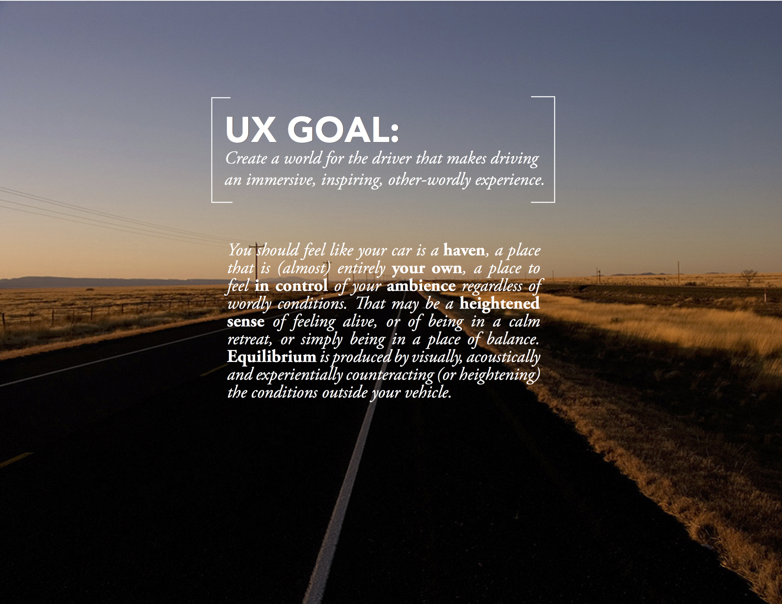
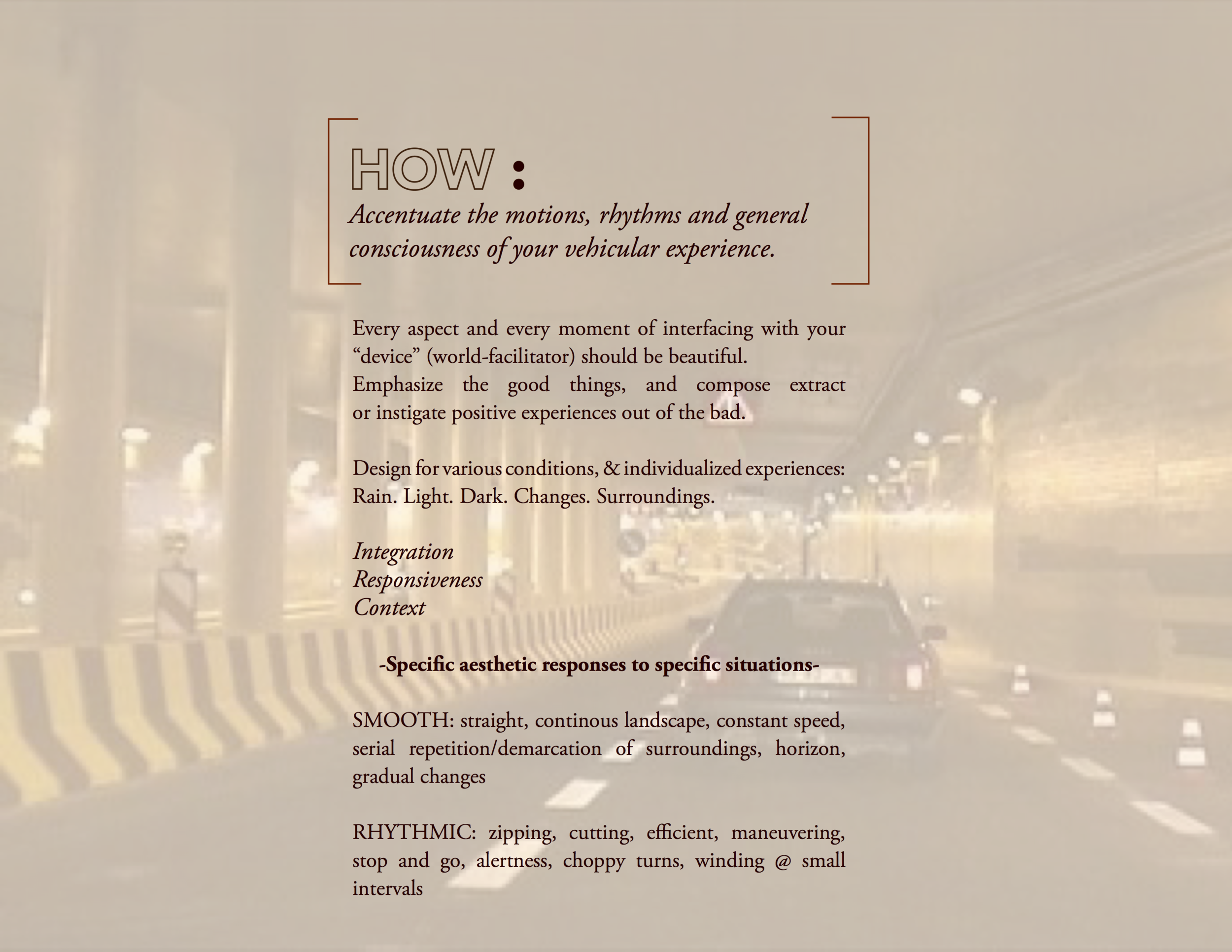
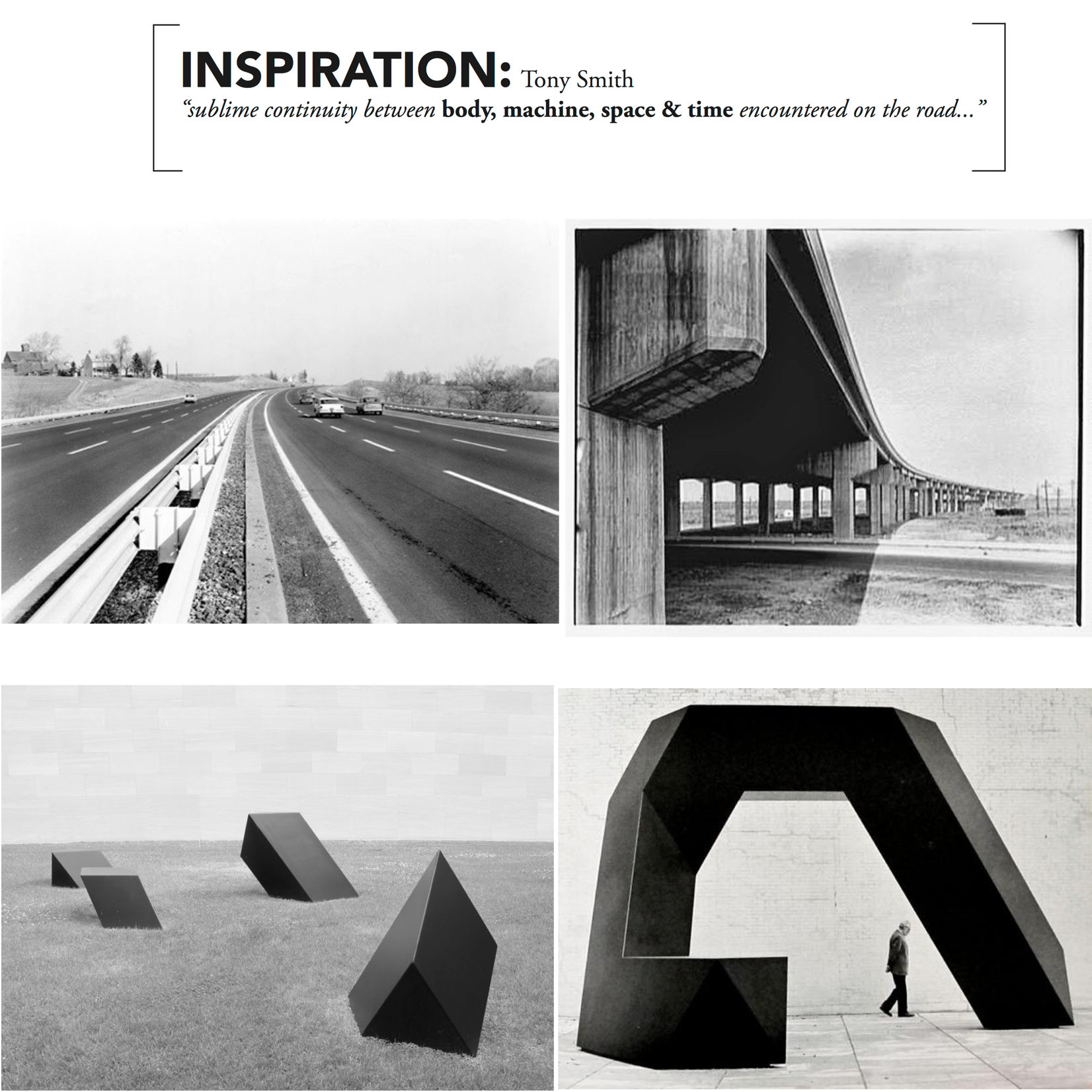
I led a dialogue with the team to determine the aesthetic foundation we wanted to inform our user experience. It was really important to me to make this a safe tool that could be used without requiring the driver to look at it often. My other goal was to create something that would immerse the driver in the world around her, rather than distract her from it, to make driving more inspiring.
UI GOALS
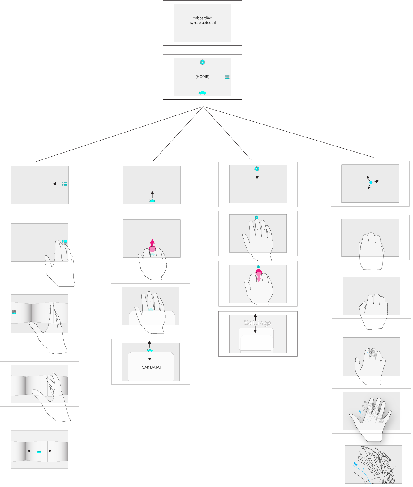
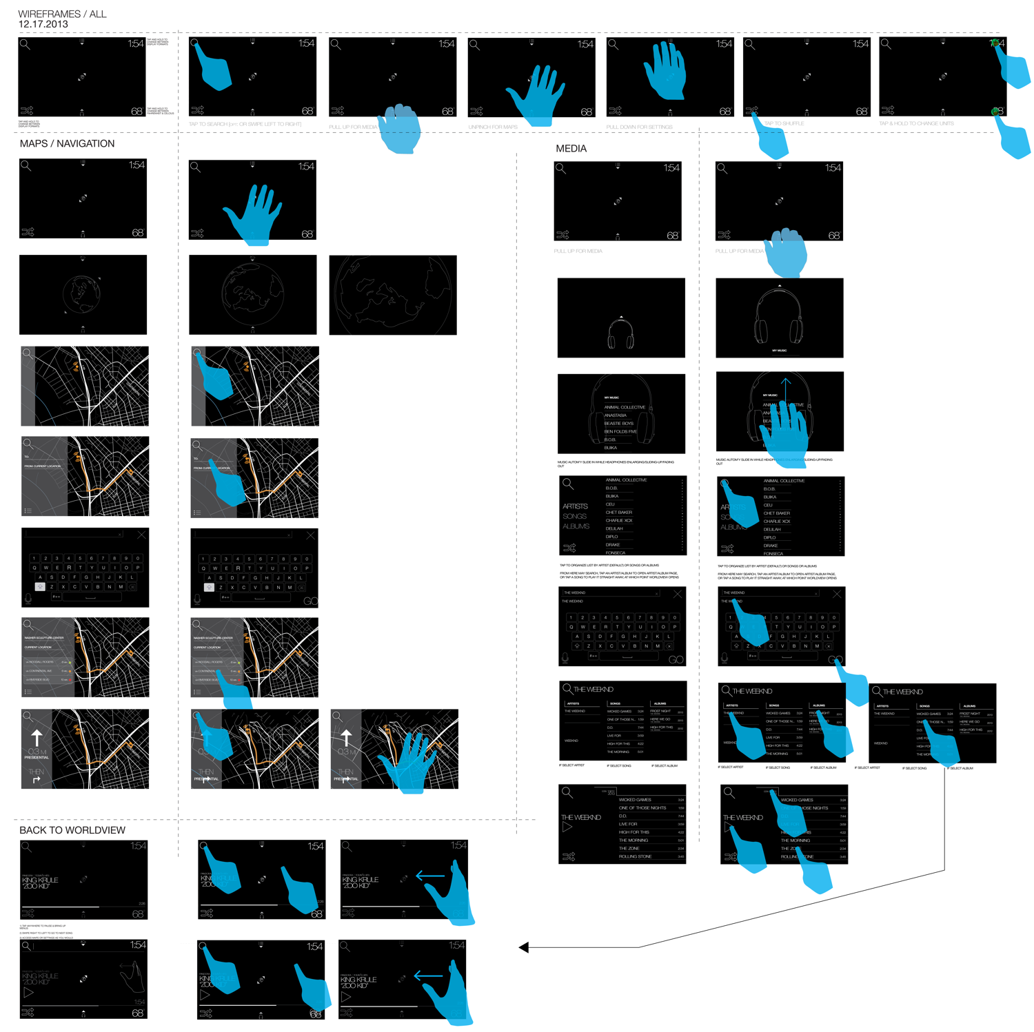
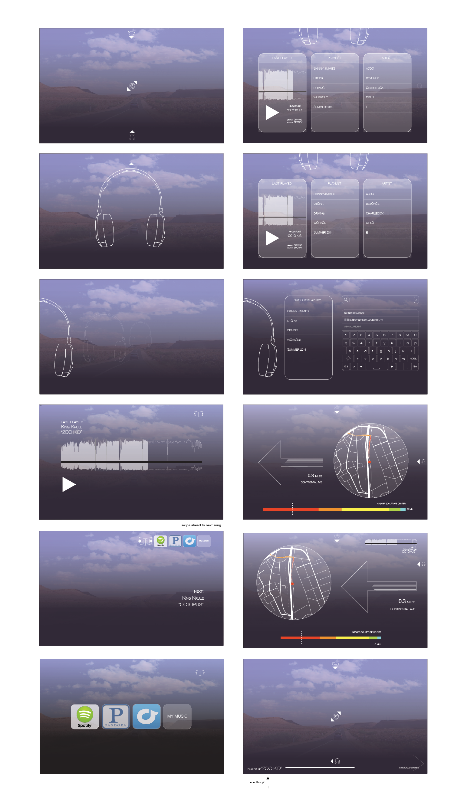
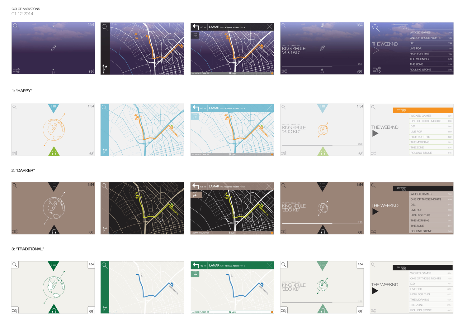
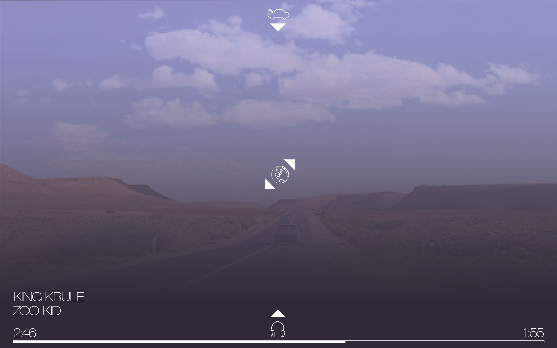
I designed the UI to meet our UX goals of an immersive, inspiring, safe experience connected the world around the driver, I treated the screen as a portal to the outside world by creating custom thin overlays that would go over images or video of the areas you're driving through. More importantly, I worked on a set of custom hand gestures using as much of the full hand as possible, to eliminate the need to make eye contact with the device while using it, as you would for single finger taps. These gestures corresponded to different locations of the screen, so that the driver could select one of the main functions of the assistant (navigation, media) by sliding in from the side it was based in (eventually these were placed in corners), and open and close the home page, which I called the Worldview, with a full-hand zoom in/out gesture.
FINAL DESIGNS
For this project we had sponsorship from Escort (the radar detector company). Their corporate innovation lab had charged us with designing and developing the project and we met with them regularly. A few months in however, their innovation department was shut down by new management, and with that our development funding was pulled. At this point we decided to pivot to our other product, Parenteen. We were able to develop the designs and engineering to a very detailed and advanced state, but were never able to fully implement and test them. The designs below are where we left off.
