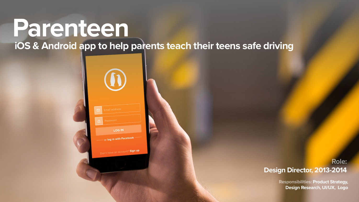
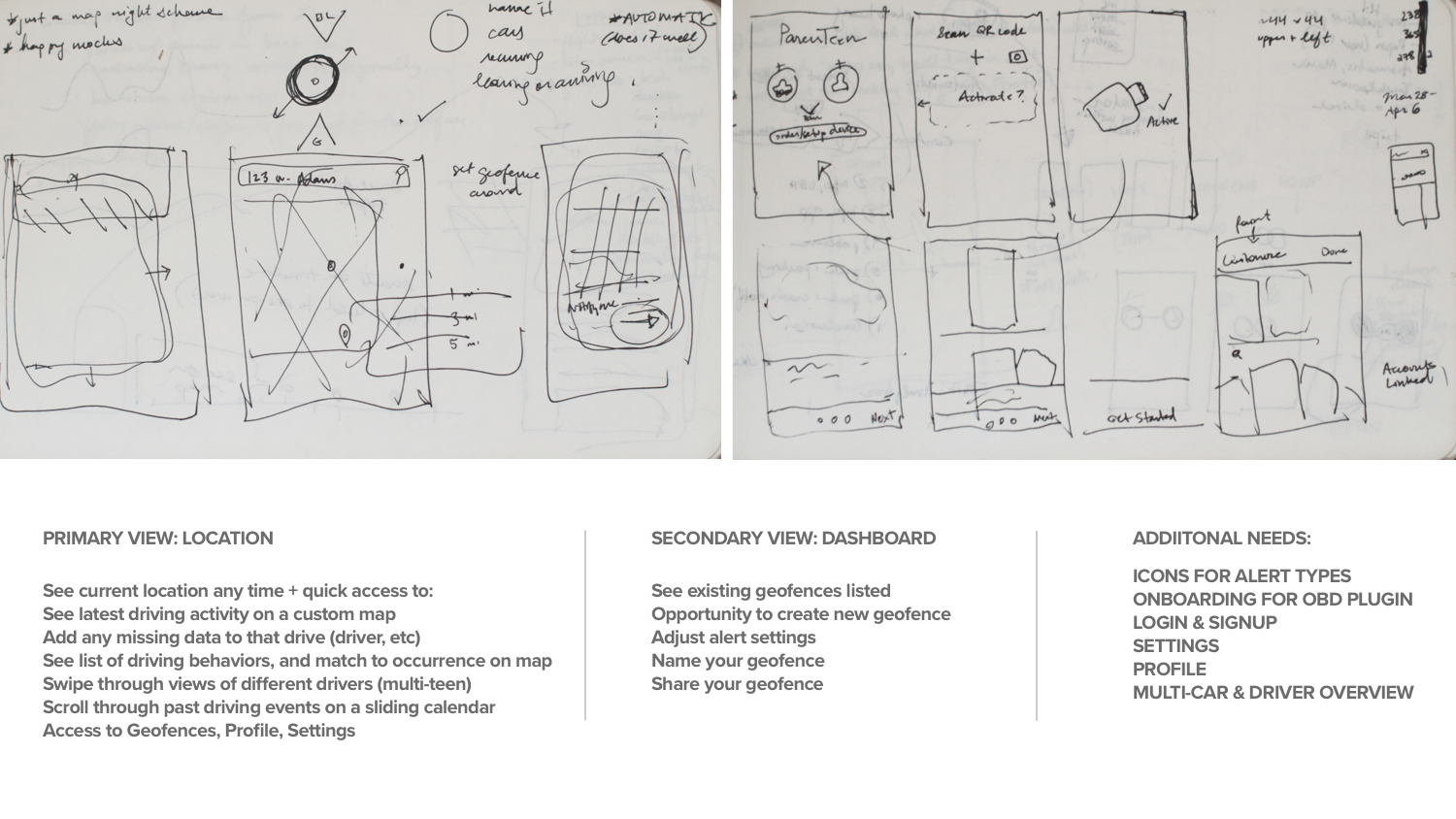
Parenteen was the second project I worked on as Design Director at Mavizon Technologies. Our schedule had a very fast turnaround of three months, as we needed to pivot from our previous connected car project, Drivenet, to a more user-facing product the company could monetize quickly. I worked closely with our CTO Brendten Eickstaedt on product direction, and with Rifaz Iqbal who developed the app, and I and took charge of design research, app architecture, UI/UX, and branding.
How Parenteen Works:
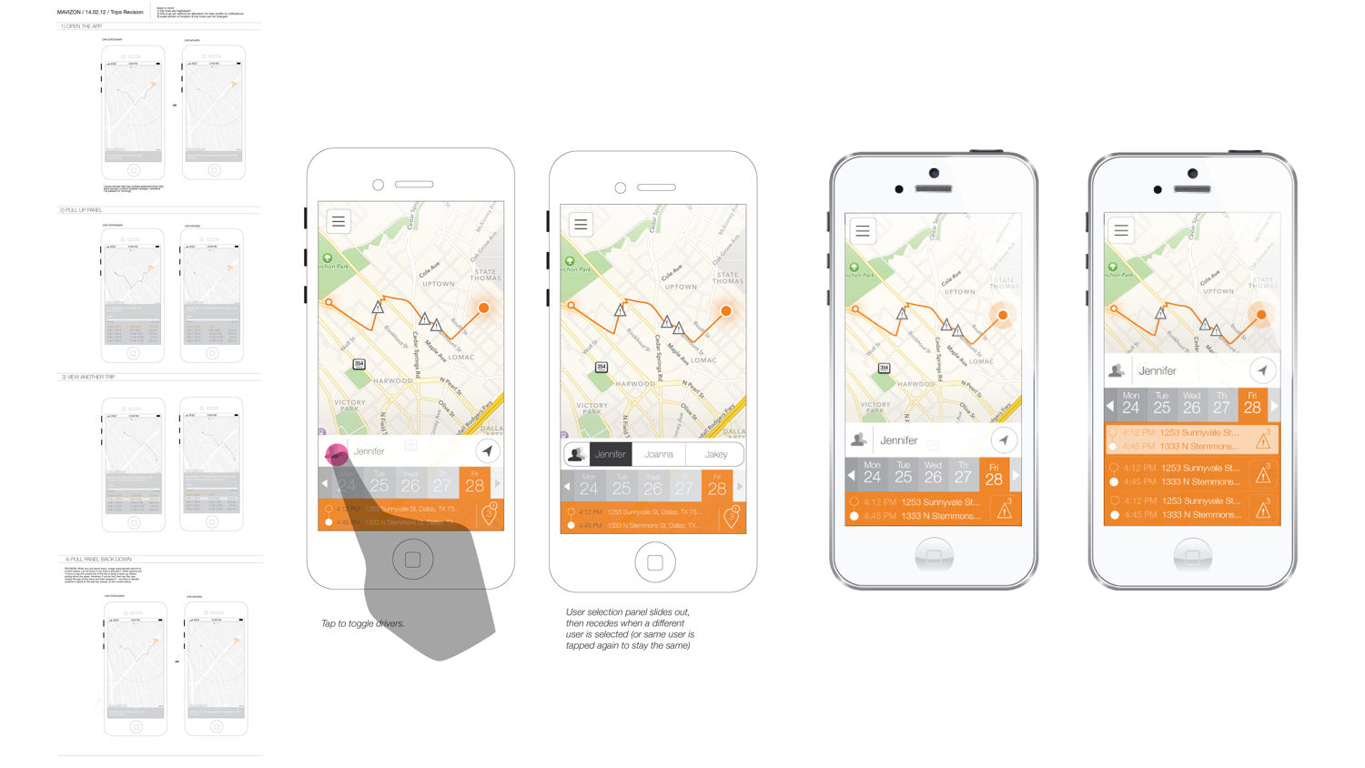
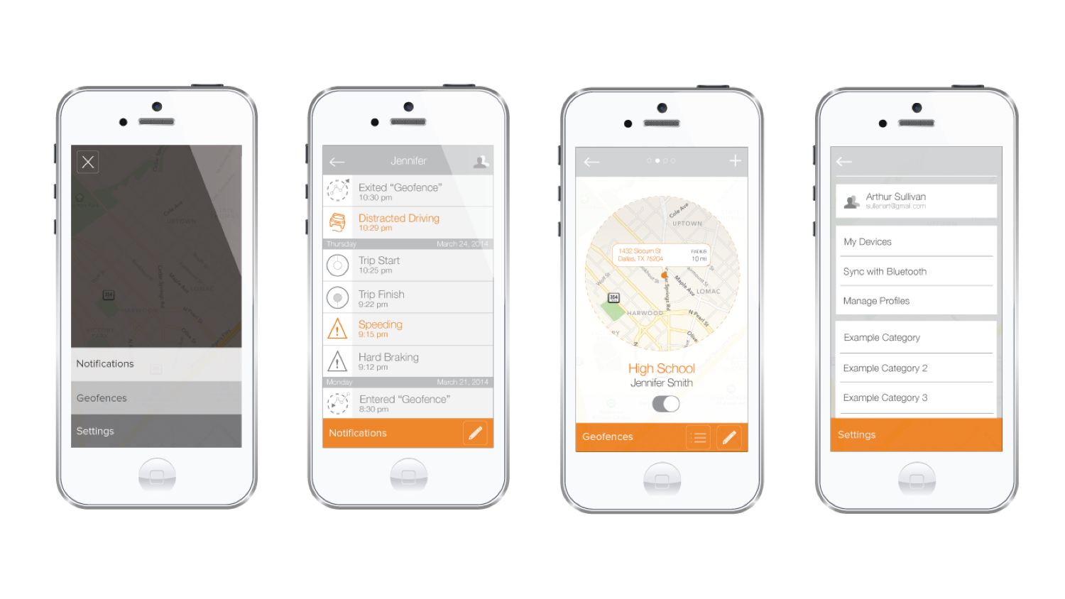
This app works in tandem with an OBD-II device to help parents learn about their teen's driving behaviors. Speed in relation to speed limits and sudden acceleration or deceleration are monitored with an alert notification system. Texting is disabled, and geofences can be set up to receive alerts when a teen is in or out of a certain zone, for instance to know that they have arrived safely at school. By watching their teen's driving on the app, parents are enabled to reward good behavior and be aware of lessons that aren't carrying through.
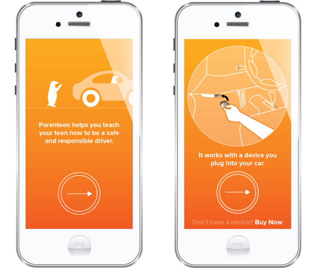
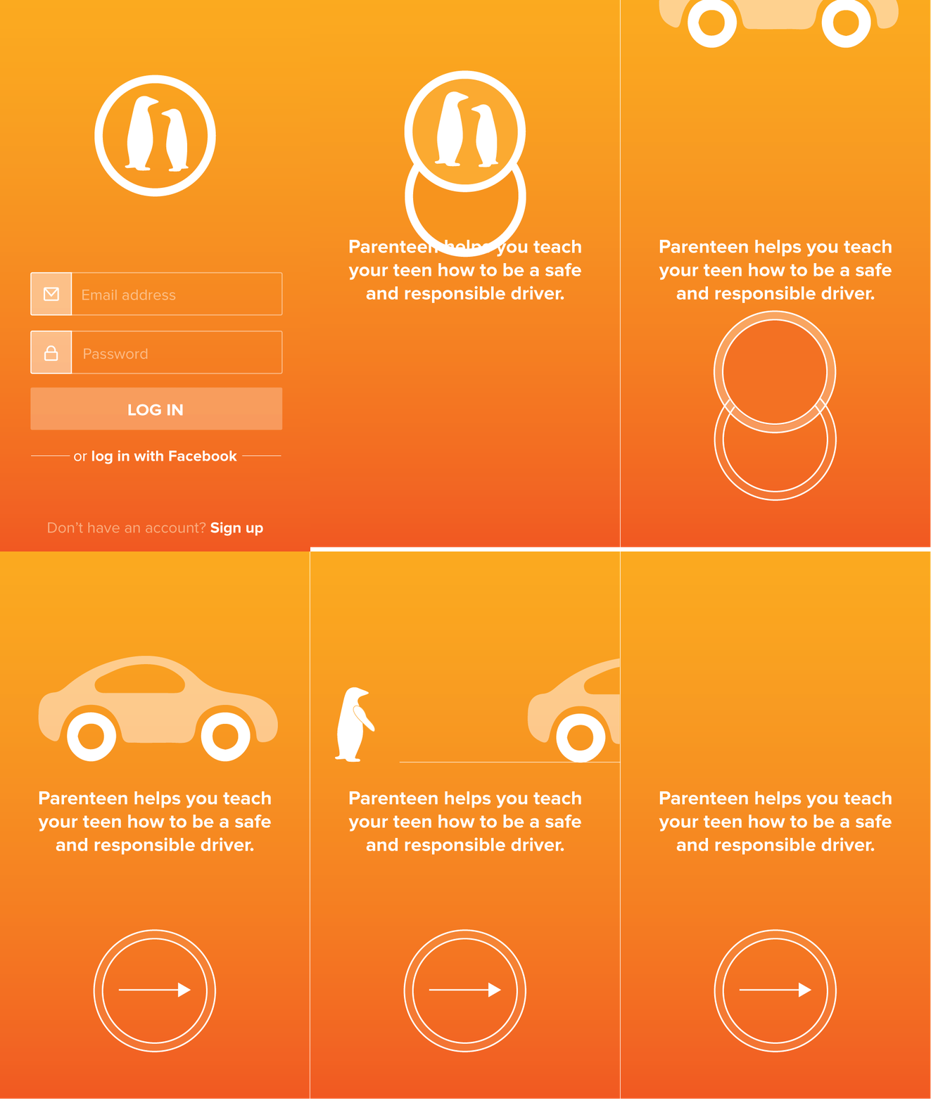
User flows had to be tailored for a few different types: 1) users who have the device and have not yet paired it, 2) users who have the device and have it paired, and 3) users who don't have it and need to see a demo of the app before being compelled to buy.
As such, onboarding was crucial, as was having dummy data on the app to represent its capabilities even without the OBD-II device installed.
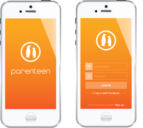
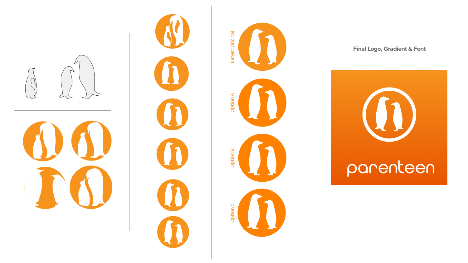
In addition to the app design, I was also in charge of the logo and branding. It was really important to use this opportunity to make sure the app didn't feel like a parental panopticon. I wanted to treat the teen as a primary user just like a parent, mostly because I didn't think the app would work unless parents and teens could use it as a shared learning tool. For that, teens had to be on board. To this end, I used vibrant colors, fun cartoons, and animations for appeal.
